Genomic & Transcriptomic Data Visualization
Estimated reading time: 9 minutes
Visualization of genomic and transcriptomic data is essential to easily exploring those large datasets for interpretation and hypothesis generation and can further help to uncover hidden patterns and trends. With the ongoing development of sequencing and computer technologies, it has become feasible for scientists and clinicians to reliably collect large amounts of high-quality sequence information from DNA and RNA molecules. The analysis and interpretation of such datasets are now routine aspects of many research projects in biology and medicine, creating a need for new tools and methods to also visualize the data and the findings.
Data visualization is the new storytelling. Plots are useful to engage the reader in the story and to guide the reader along the intrinsic paths of scientific discoveries. Meaningful visualizations can easily bridge the gap between scientists from different fields and can also be used to engage and elate the general public for the newest scientific outcomes. A well composed graphical abstract, for example, simplifies the underlying scientific context by specifically highlighting the main findings of the manuscript, and has the power to turn complex facts into approachable knowledge for everyone.
Basics of data visualization
“Graphical excellence is that which gives to the viewer the greatest number of ideas in the shortest time with the least ink in the smallest space.”
- Edward R. Tufte, The Visual Display of Quantitative Information
The first and foremost decision is to choose the right chart or layout to effectively depict the data. There is no ‘one-fits-all’, and a scatterplot might be useful to depict correlations in the gene expression, but without being the optimal choice to compare different translocations of a cancer genome. Thus, the chart type should be chosen depending on the data, the audience, and the purpose of the visualization. The most commonly used charts are the line graphs, the bar graphs/histograms, and the fundamentally flawed pie chart. Those charts are rather simple and the number of variables that can be displayed is small. Line graph and bar graphs are suitable to visualize low dimensional clinical data, but aren’t of much use to display high dimensional genomic datasets.
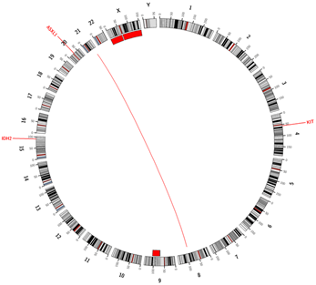
Space-filling layouts, such as Hilbert curves, payoff to preserve the sequential nature of most genomic features, while simultaneously allowing the visual integration of multiple data sets (e.g. mutations, copy number changes, translocations, etc). Circular layouts can also be used to display sequences in a space-saving way and can be extended to display interactions. Once the basic setup is chosen the plot can be enriched by mapping multiple variables to the plots’ aesthetics such as shape, color, and size.
Another very important aspect of every graphic is the choice of color. Color should not be added to simply decorate a graph, but should be used to provide either additional information or to facilitate the interpretation of intricate graphics. Above all else, the graphics should depict data and the data-ink ratio, defined as data-ink divided by the total ink used in the graphics, should be intended to maximize. Hence, non-data-ink (e.g. background color) and redundant data-ink, have to be erased from a graphic in order to focus on the main aspects. At the same time, a data visualization should be aesthetically pleasing, to enhance the message of the graphics. Colors can be used to emphasize contrasts, making it easy to perceive the differences between groups or conditions. Color gradients are especially useful to visualize continuous data and to visually highlight the progress from low to high. Distinctive colors are chosen for categorical data types, such as gender or risk groups. Bright colors should be avoided so as to not distract the observer from the actual message of the plot. In order to make the chart accessible for everyone, it is advised to choose color-blind-friendly palettes.
Genomic data visualization
Another space-filling layout for the visualization of genomic data are Hilbert curves2. Again, the sequential order of the chromosomes is maintained and pressed into a 2D plot. Evenly spaced dots that are added to the lines, can provide aggregated information for a specific base-pair range or for annotated elements such as genes or exons. The possible application of those plots are manifold, and they are especially useful for the comparison of different genomes.
The information of genomic data is comprised of different data types, such as copy number (CN) changes, structural variants, and small nucleotide variants. The CN states of the different chromosomes are mainly depicted by scatter plots, with each dot representing the CN state of a certain base pair window. Due to the relational nature of structural variant data, arc or ribbon plots are used for the visualization. Modified heatmaps are used for the comparison of the mutation status of different samples. Here, distinct colors are used to indicate mutations, variants, and the wild types. If cytogenetic data is available, a binary track for the karyotype (aberrant vs. normal) is added. Despite the simplistic nature of the plot, it allows for an easy comparison between cohorts to identify and visualize differences in gene mutation frequencies. It also facilitates the identification of mutually exclusive events.
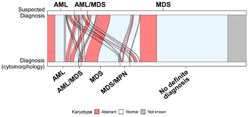
Many genomics datasets, contain also, the progression information that must be visualized accordingly. The sequencing reveals the genomic composition profiles of different cell populations across time. Those profiles are commonly visualized using clonal evolution diagrams3. Most of those diagrams are qualitative visualizations that heavily rely on shape and color aesthetics to reflect the time-dependent changes, and the relationship between the clones. Alluvial plots, a form of sankey diagrams, can also be used to track and visualize time-dependent changes. In a simplified form, they can also be used to represent relationships between variables, integrating clinical and genomic data (Figure 2).
Transcriptomic data visualization
Transcriptomic data visualization also touches on the representation of quantitative data, without being limited to it. Very famous and broadly used charts are the volcano plot, a special form of the scatterplot that shows significance versus magnitude of change, and the heatmap. A heatmap usually depicts genes as rows, samples as columns, and the color of the tiles reflects either the expression intensity or the fold-change for comparisons. The color gradient usually ranges from green to black/grey to red, which makes it almost impossible for a color blind person to interpret the plots. Hence, recent versions make use of more color-blind-friendly palettes such as blue & orange or blue & red combinations. A visual representation of quantitative data is not always the best choice. If there are just two conditions and the differently expressed genes are supposed to be visualized, a heatmap is just a waste of space. In this case, a table would be way more informative. Bar plots are usually used to visualize the expression of a selection of genes and are remnants from the representation of qPCR data. Box plots (or Whisker plots) are mostly used to visually check for the effect of normalization methods or to compare the expression between groups. Recently, the violin plot; a box plot with the addition of a rotated kernel density plot on each side, has been introduced to display single cell data.
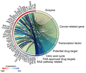
All those plots can be used to display the quantitative value of the transcriptome data, but the data also holds information regarding the relationship between genes and/or the association between genes and pathways/biological processes. The pathway information is sequential and, hence, is usually visualized as a type of flow chart (e.g. KEGG pathways4). Such a flow chart is limited to display only a handful of pathways at a given time. In order to integrate gene expression data with the results of pathway enrichment analysis, multi-layered graphics such as modified Circos plots or, more generally, chord plots can be used (Figure 3). Those plots are very useful to depict relationships or interactions between the different variables.
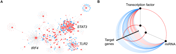
Interactions can also, be easily visualized and analyzed with networks. In the case of transcriptomic data, the nodes usually represent genes and the edges depict some form of interaction (e.g. transcription factor and target gene) or correlation (Figure 4A). Correlation networks are undirected networks and the weight of the edges is proportional to the correlation coefficient. Interaction networks can either be undirected or directed, depending on the available information. Directed networks are more informative and can be used to model cellular processes, and to build prediction models. However, the knowledge of evidence-based interactions is limited. In biological sciences, such networks can easily get confusing, due to an increased number of nodes and edges, resulting in a network ‘hairballs’. Those hairballs aren’t visually that attractive, and it is almost impossible to get meaningful information out of them. Hive plots have been introduced as a linear layout for network visualization that can be used to identify patterns of interest5. They can, for example, be used to display the regulatory relationship between transcription factors, miRNAs, and target genes (Figure 4B).
Those are just a few examples of genomic and transcriptomic data visualization, but it already shows the amount of information that can be extracted from those datasets, and can be used to create meaningful and informative plots.
Concluding remarks
Data visualizations are exceptionally helpful to explore large genomic and transcriptomic datasets and to detect hidden patterns in the data. Thinking about the content and composition of a figure for a manuscript, can help detect the holes in the story. It can also help one realize if a dataset and the hence drawn conclusions, are stretched too thin. Even the best design cannot rescue a failed or missing content. However, data visualizations should not be used to trick the reader by depicting slight differences out of proportions or by distorting the perspective. Visual representations of data must always tell the truth, and should be used to visually enhance the uniqueness and quality of the underlying dataset and hypotheses.
References
1Krzywinski, Martin, et al. "Circos: an information aesthetic for comparative genomics." Genome research 19.9 (2009): 1639-1645.
3Krzywinski, Martin. "Visualizing clonal evolution in cancer." Molecular cell 62.5 (2016): 652-656.
4Zhang, Jitao David, and Stefan Wiemann. "KEGGgraph: a graph approach to KEGG PATHWAY in R and bioconductor." Bioinformatics 25.11 (2009): 1470-1471.
5Krzywinski, Martin, et al. "Hive plots—rational approach to visualizing networks." Briefings in bioinformatics 13.5 (2012): 627-644.
The author

»Do you have questions regarding this article or do you need further information? Please send me an e-mail.«
Dr. Wencke Walter